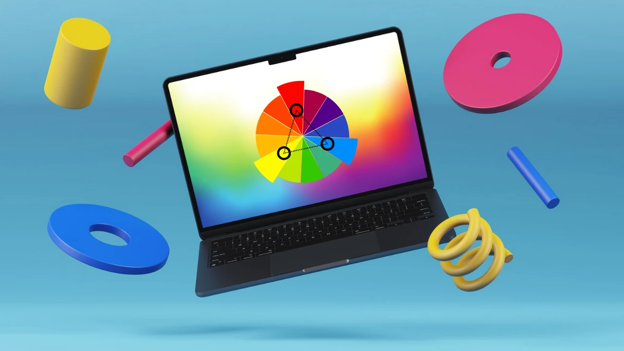
If you use a MacBook Pro, such as the M1, M2, M3, and M4 series, choosing the right Color Profile is crucial. This will ensure the colors in your photos, videos, and graphics look exactly how they should. Because different profiles are better suited for other tasks—whether you’re a video editor, photographer, or just a daily user—choosing the best Color Profile for your MacBook Pro is crucial. In this brief article, let’s examine which mode might be the best option for you.
1. General Use (Daily Use, Movies, Web Browsing)
Recommended Profile: Color LCD (Default)
This profile is built into every MacBook Pro. Apple calibrated it so that colors are neither overly saturated nor dull.
- Brightness and white balance are auto-adjusted
- Most natural look
- Best for everyday users
How to set it in Settings:
System Settings → Displays → Color → Color LCD
2. Photo Editing (Lightroom, Photoshop, etc.)
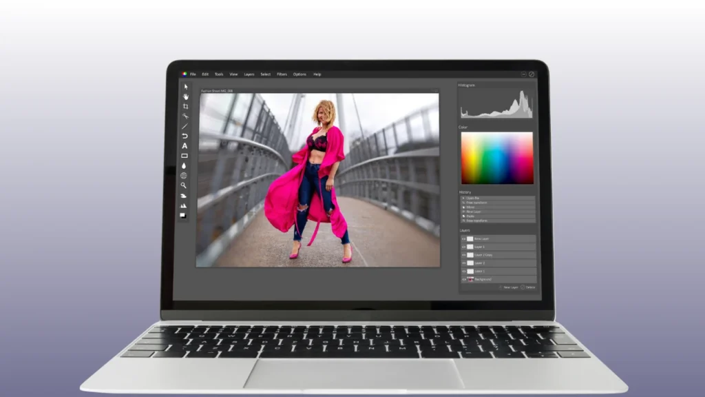
Recommended Profile: Display P3 or Adobe RGB (1998)
If you’re a photo editor, or if color accuracy is of paramount importance, you should set these settings for your MacBook Pro:
- Display P3 is Apple’s Wide Gamut color profile, which is naturally optimized for the MacBook Pro’s display.
- The Adobe RGB profile is better for print work because it has a wider spectrum of colors.
Important Tip: Display P3 will be most accurate for MacBook Pro models from 2016 or later.
3. Video Editing (Final Cut Pro, DaVinci Resolve, Premiere Pro)
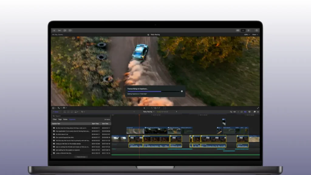
Recommended Profile: BT.709 (HD Video) or BT.2020 (4K/HDR)
If you’re into video editing, getting the right brightness and color tone is crucial for your video projects. Learn about color below.
- BT.709 is the standard for TV and online HD video.
- BT.2020 for HDR and 4K video production.
When editing in HDR on your MacBook Pro, choose the “HDR Video (P3-ST 2084)” profile — this will provide true-to-life color depth. This will ensure your MacBook Pro displays color accurately when editing video.
4. Web and Graphic Design
Recommended Profile: sRGB IEC61966-2.1
This MacBook Pro Profile Color is ideal for those designing websites, banners, or social media graphics. This is because most websites and mobile displays follow the sRGB color space, so the color you create will be the one the user sees. This makes this MacBook Pro Profile Color ideal for those working in web and graphic design.
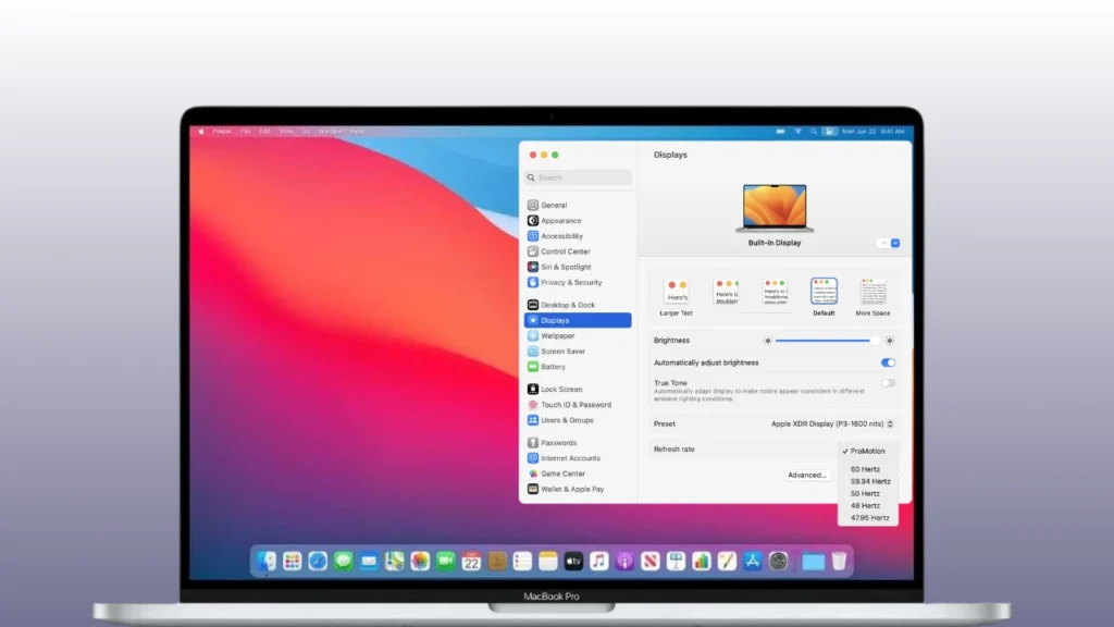
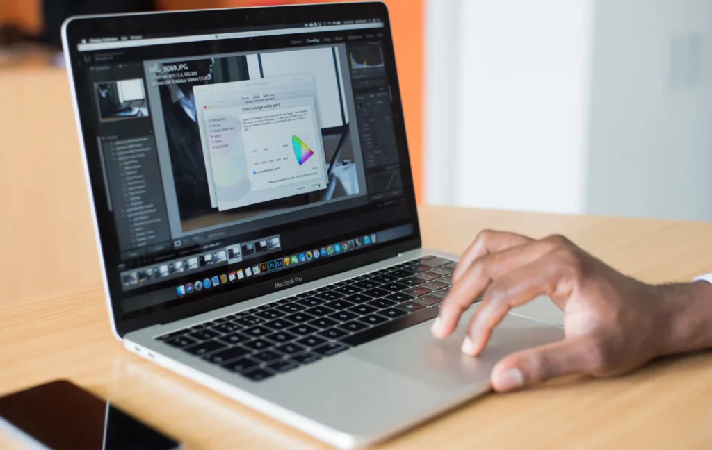
How to Replace or Calibrate
- Go to System Settings → Displays → Color
- Select a profile from the list (e.g., Display P3, sRGB, etc.)
- If you want, you can adjust the gamma and white point by clicking Calibrate…
Take Care of True Tone and Night Shift
- True Tone: Adjusts the display’s white balance based on the room’s lighting. It’s good for the eyes, but turn it off when editing.
- Night Shift: Provides warmer colors at night. Also, turn this off when editing photos/videos.
Best Color Profile for MacBook Pro (Summary)
| Use Type | Best Color Profile | Specialty |
|---|---|---|
| Daily Use | Color LCD | Natural and balanced color |
| photo editing | Display P3 / Adobe RGB | Wide Gamut, Accurate Color |
| Video Editing | BT.709 / BT.2020 | Standard Video Color Profile |
| Web Design | sRGB | Best for online content |
Final Thoughts
Choosing the right color profile for your MacBook Pro depends entirely on how you use your device. For everyday users, the default color LCD mode provides a natural and balanced look. If you’re a photo editor, Display P3 or Adobe RGB (1998) ensures accurate and vibrant colors. For video editors, BT.709 or BT.2020 is ideal for broadcast and HDR standards. And for web or graphic designers, sRGB ensures your work looks consistent across most screens.
In short, always remember that there’s no single “best” color profile for everyone—the best choice is the one that matches your workflow. Take a few minutes to understand these profiles, and you’ll see how the right settings can truly transform your MacBook Pro’s display into a color accuracy powerhouse.
SEE ALSO: What the M5 Leaks Reveal About Apple’s 2026 Roadmap?
